 A POLITICAL BATTLE IS RAGING ACROSS THE U.S., indeed across the world, over “global warming.” Unfortunately most of this debate consists of folks calling each other names — without any recourse to facts.
Are there any facts available to help judge this debate? For example, what does the United States Historical Climate Network (USHCN) temperature data show regarding “global warming”?
The USHCN is a data set of monthly averaged maximum, minimum and mean temperature, developed to assist in the detection of regional climate change. The USHCN is comprised of 1,221 high-quality stations from the U.S. Cooperative Observing Network within the 48 contiguous United States.
The figures below are from the National Oceanic and Atmospheric Administration (NOAA) National Climate Data Center; they are available at http://www.ncdc.noaa.gov/oa/climate/research/ushcn/ushcn.html.
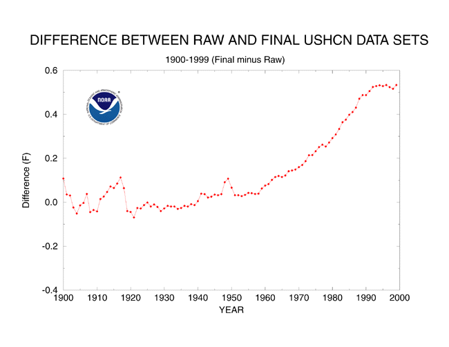
The first chart, below, shows the total adjustments applied to the actual instrument readings (raw data) from the USHCN. The “adjustments” are large and uniformly positive (i. e., “warming”) from 1950 through 2000.
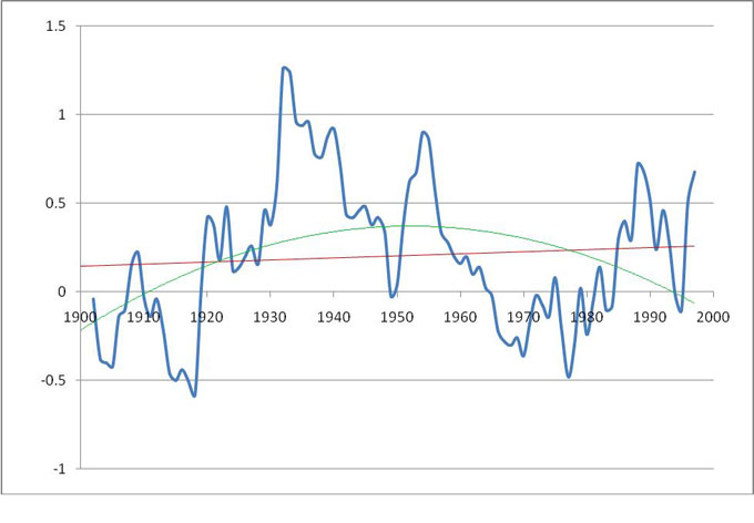
The unadjusted data (raw data) for the temperature anomaly profile (i.e., without any ex post facto adjustments) is shown in the second chart (along with a dashed trendline suggesting a decline since about 1950), below. Both the graph and the trend line are from the NOAA site referenced above.
So the question is, what do you conclude from this official U.S. government temperature data? Is this evidence of global warming?
If you can answer this question without insulting anyone — especially me — go to the head of the class …
Bob Moore is a Benicia resident.


Bob stated: So the question is, what do you conclude from this official U.S. government temperature data? Is this evidence of global warming?
Bob,
It seems that the question is not if we are going through a period of ‘climate change’ or ‘global warming. Indeed one can take almost any several decades long period of time throughout history and make a case of either a temperature increase or decrease during that period. The planet’s temperatures have indeed fluctuated in a sinusoidal like fashion for ions.
The question really is: Has man’s impact been such that we now are living in an irreversible upward temperature trend.
That point is the heart of the real dispute.
I can’t find the second chart with the “trend lines” on the website you list. Where did you find them.
All the adjustments are reasonable and necessary to get a valid average temperature: adjusting for when the measurements and where they are made (stations move), adjusting for urban heating (which would artificially increase temperatures with time), etc. are documented in the references and are valid. Fitting an obvious parabola to the curve seems in the second chart seems odd, when there is no valid reason it would follow a parabola and obviously doesn’t, nor would I draw conclusions from that. Finally, extrapolating from US 48-state data to global data is a stretch and not valid. Every school kid learns that only a small fraction of the earth’s surface is land and the US is a small fraction of the global land. You need to use global measurements, and carefully validate and average them. It is not a simple task. Similar work has been done for sealevel measurements, and they are also noisy but unequivocal that sealevel is rising (in good part due to increasing ocean temperatures, as water density is a function of temperature). Hope I did not insult anyone.