 WHY DO I CARE WHETHER CALIFORNIA IS WARMING? Well there is a group of very loud and angry people yelling that we are all going to die of heat stroke. If that is true, I plan to move to Alaska. But before I take such a drastic step, I would like to know if there is any factual basis for this belief.
Wouldn’t you?
Fortunately, there is an official government website that provides historical data for the last 118 years. That should help us to understand whether this belief that we are all going to die of heat stroke has any basis in fact. The website is NOAA’s National Climatic Data Center at http://www.ncdc.noaa.gov/oa/climate/research/ushcn/ushcn.html and it provides plots of historical temperature data for California (or any other state or region of the U.S.) from 1895 to 2013.
Unfortunately, this NOAA data is not actually the original temperature measurements; it has been “corrected” by increasing the temperature readings at a rate of about 1 degree Fahrenheit per century for the 1950-2000 period.
(For the original of the correction curve, see http://cdiac.ornl.gov/epubs/ndp/ushcn/ts.ushcn_anom25_diffs_urb-raw_pg.gif. The explanation for the “corrections” is on the NOAA website cited above; but since the original data isn’t available, we will have to use this “corrected” data.)
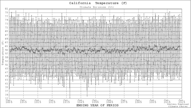
The first chart from the NOAA website, below, shows the variability in the annual average of the daily temperature (dark line) along with the monthly average for the 118-year period (lighter lines). The annual average just seems to bump along around the 118-year average of about 59 degrees Fahrenheit and the monthly bounces between the highs of summer and the lows of winter. The hottest monthly average was in 1900 (80 degrees) with the second highest in 2007. Of the 10 hottest months, five were in the period from 1897-1935 and the other five were from 1989-2007.
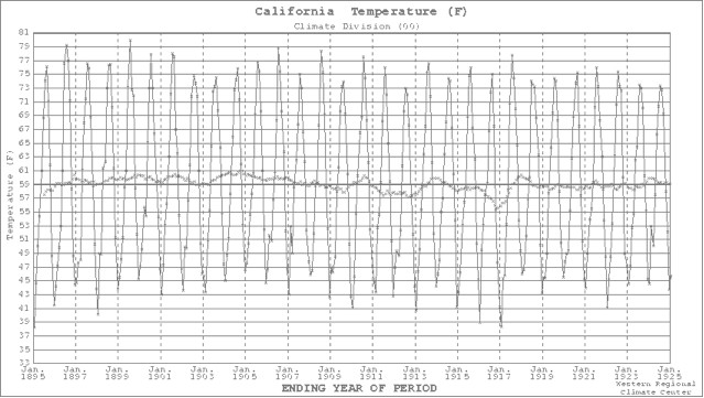
The next four charts below show the annual and monthly temperature averages for each of the 30-year periods of the 118-year historical data period. Thirty years is the period for establishing climate averages, according to the World Meteorological Organization.
I don’t see any clear evidence of either “warming” or “climate change” in California for these four climate intervals. I guess all of those very loud and angry people who are yelling about catastrophic “warming” and “climate change” must base their belief on something other than the historical data.
But I feel better now that I have looked at the facts. I guess that I won’t be moving to Alaska after all …
Bob Moore is a Benicia resident.


You got it backwards Bob, the correction curve shows the difference between raw and final, and that is about 0.5 degrees in the last 30 years. Here is the formula: raw minus final = 0.5 which means raw is bigger than final by 0.5. Why? A big factor is that many thermometers are in or near heavily populated areas which result in heating due to normal human activities. You only had to read the documentation to get that. So the corrected data are actually LOWER than the raw.
You only have to look at the graphs to see that the last 30 years are consistently above the 59 degree line you point out. So yes, it has gone up. Maybe not enough to drive you to Alaska, but those two degrees make a big difference in water consumption in the millions of acres of farms in the Valleys.
Greg:
Good grief… everything in your comment is wrong!
Read the sub-title of the NOAA figure “1900-1999 (Final – Raw)”
Read the NOAA description of the correction curve: “The cumulative effect of all adjustments is approximately a one-half degree Fahrenheit warming in the annual time series over a 50-year period from the 1940’s until the last decade of the century”.
Not the first time Bob has been off base.
Hey Greg:
An acquaintance just pointed out your March 21st comment to me — as well as commenting that the websites that I cite clearly show that everything you say about the NOAA Temperature Adjustments is wrong and wondering why I had not responded to your comment.
This reader wanted me to confirm your errors in a Reply on the Herald website — so that others would not be misled by your erroneous statements.
So here goes — my correction of your comment is in the interests of factual accuracy — not a “gotcha”.
If you will carefully read the sub-title of the official NOAA graph it clearly states “1900-1999 (Final minus Raw)”.
It would make absolutely no sense to do it the other way around (your version) because that would make warming adjustments negative and cooling adjustments positive.
The NOAA discussion about this graph (next to the graph on the NOAA website ) specifically reinforces this fact, as follows, quote: “The cumulative effect of all adjustments is approximately a one-half degree Fahrenheit warming in the annual time series over a 50-year period from the 1940’s until the last decade of the century”.
Thanks for your interest in my factual analysis. I hope you will continue to read my columns.
Bob